It might help a bit. I remember Infinity used to do this.
You must log in or register to comment.
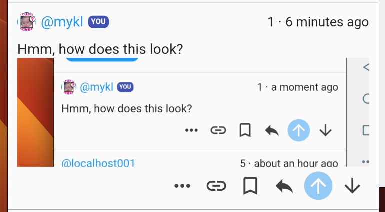
Hmm, how does this look?

(A screenshot of a screenshot, very on point for today)
+1 Seeing every commenter name in blue throws me off every time. In my mind, blue is for OP, orange is for myself, green is for mods/admins, purple is for the app developer, and black/gray for everyone else. Or some variant like that, I don’t remember exactly which colors Apollo used for reference.
blue is for OP, orange is for myself, green is for mods/admins, purple is for the app developer, and black/gray for everyone else
Make it customizable please!
Those also seem to be the colors for boost, that would be great!
Good point. Flags or colours for other roles would also be useful.
Same but admins were red.


