Hello,
I think that you need to improve dynamic Colors cause they are really subtle, so it’s mostly white and I also struggle “separating” posts. Also, it would be nice if we could have the option to show post content no matter the base view type :))
Could you clarify what dynamic colors are? Do you mean material you (ie. theme colors based on your phone’s wallpaper)? Summit uses default Material components for most things so everything should be themed/colored based on Google’s design spec. Eg. progress bars use a specific theme color based on the theme. The colors chosen are all based on Google’s material design spec. If something looks out of place please take a screenshot of the issue and sent it to me so I can take a look.
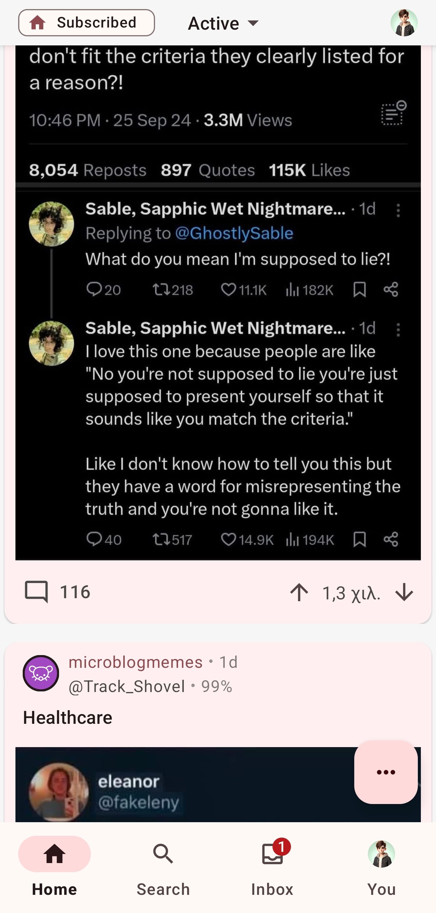
Hey, thanks for responding. Yeah. That’s what I mean. In my mind Material You=Dynamic Colors + MD3, so that’s why I said dynamic Colors. Since I have spent some time building android apps with Kotlin + Jetpack, I know that you can choose the color scheme of a component ( Primary, secondary, background, etc). In my opinion some of the color choices look a bit off. For example when I scroll between posts, Summit looks like this:

Its kinda hard to separate different posts. You can take a look at the Google drive app, google home app, google files app, google tasks, easter eggs app. These apps in my opinion have implementated material you really well. You can also check for some more apps with great material you implementation here
Anyway, I hope my post doesn’t come out as rude, I really like your app and I think you’ve done a great job! If you want a follow up, please ask me. I hope I made things clearer now
Ps: jerboa (official Lemmy app) also has some good design
PS2: on second thought I think it just needs some shadows.
Thank you for the feedback. I took a look and it looks like the cards do have shadows already except they were clipped due to a bug. I’ll fix this bug for the next update.
If my changes in the next update doesn’t fix the issue of “post separation” completely then feel free to ping me again and I will make a more permanent fix. I’m thinking about using a bordered card instead of the one being used today. Bordered cards have way more contrast however they don’t look at clean.
Happy to help!
Also, it would be nice if we could have the option to show post content no matter the base view type :))
Could you please clarify on this point? Thank you.
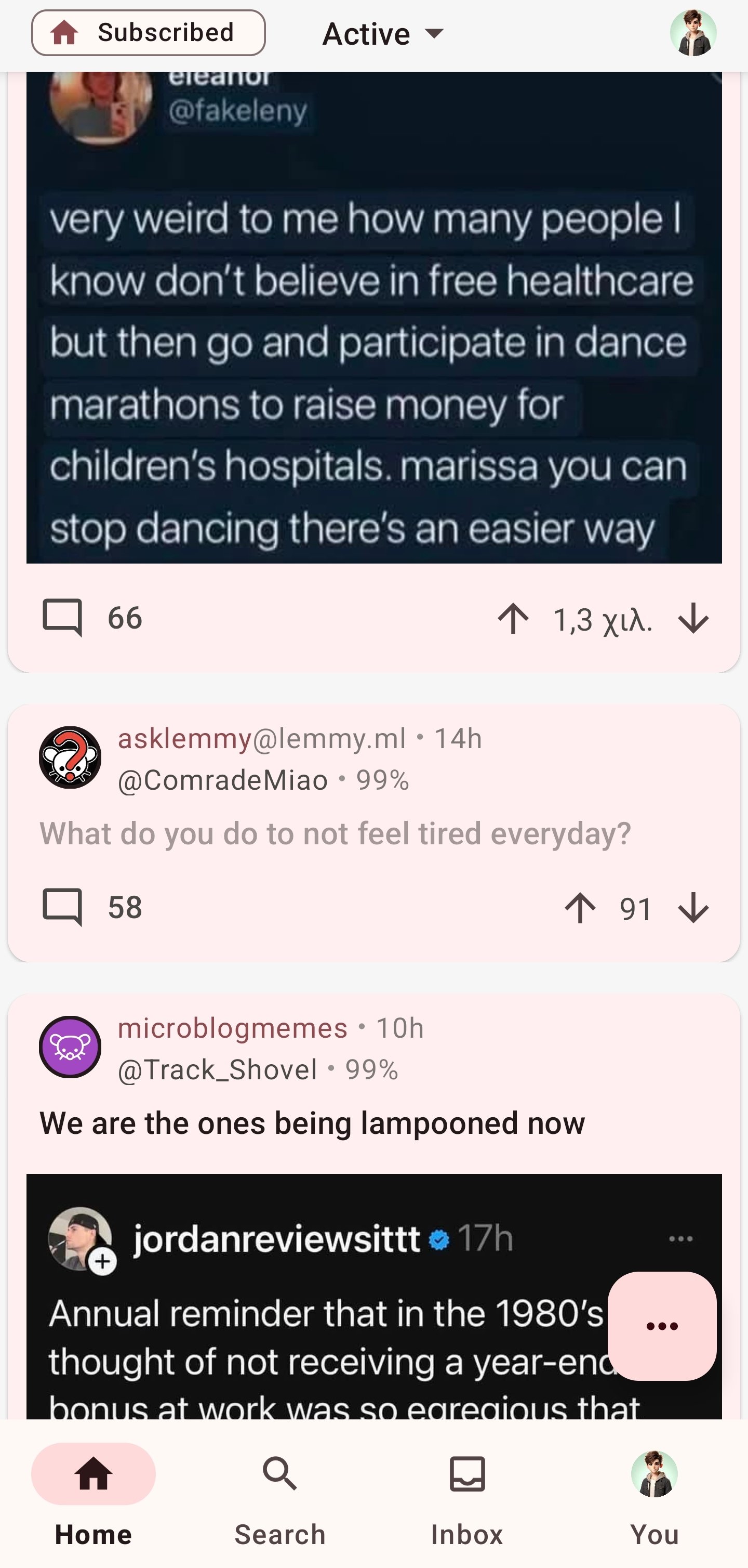
Oh, yes. When I use the Cards 2 layout which I prefer more because of the rounded corners and the posts having a devider, summit looks like this:

You can see that there is no post content like Full layout has ( I think it’s full layout)

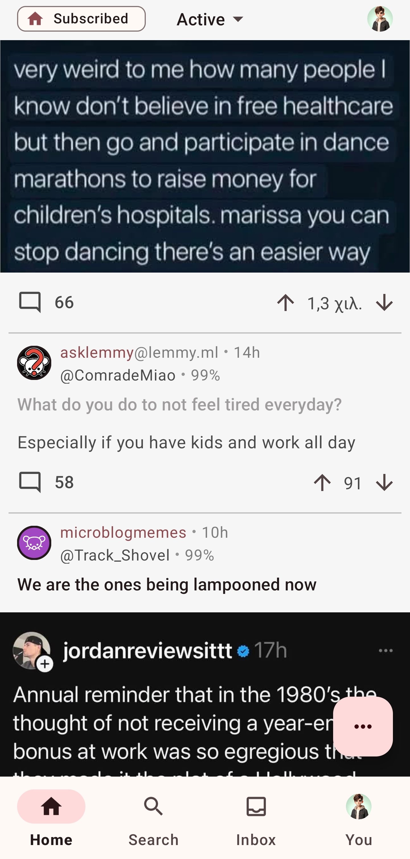
This layout shows post content. So I believe it would be nice if we had the option to see post content no matter what layout we choose :)
Sorry for the late response. Been very busy this week. Just so I understand correctly, what you really want is “full layout” but with cards. Is that correct?
Don’t worry about it!
Yeah I guess. I just want post content to be visible (or at least an option) no matter the view type :))


