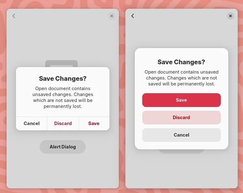
New GNOME dialog on the right:

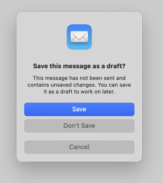
Apple’s dialog:

They say GNOME isn’t a copy of macOS but with time it has been getting really close. I don’t think this is a bad thing however they should just admit it and then put some real effort into cloning macOS instead of the crap they’re making right now.
Here’s the thing: Apple’s design you’ll find that they carefully included an extra margin between the “Don’t Save” and “Cancel” buttons. This avoid accidental clicks on the wrong button so that people don’t lose their work when they just want to click “Cancel”.
So much for the GNOME, vision and their expert usability team :P


My only problem with both designs in your images is the colors. It’s a pretty standard part of UI design (in real life and on computers) that “red means cancel” and “green means continue.” Apple using blue is no big deal and I’m 90% sure they just use a user chosen “highlight color.” (Maybe Gnome as well?) But cancel or delete or similar things should probably be red or another color that signals “Stop.”
I’ve always thought Bootstrap, the web design library, has a good set of base colors. Red means danger. Light blue means info. Green means yes or success. Yellow means warning. Other buttons are a darker blue — basically the highlight color. (Not saying they chose the best version of those colors. Just that the general idea is consistency and what users most naturally expect.)
The “Save” button uses the accent color which is blue by default. With configurable accent colors coming to GNOME 47 and GTK/Libadwaita, you can choose a red accent color.
See the original description of the screenshot:
It’s just an accent colour and can be changed.
Where can i change easily accent colors in Gnome without using extensions?
Accent colors are coming with GNOME 47.
Yup, i know, its just not possible atm. But thank you anyway :)
Yes it does. Those guys did a really good job.